
Flexboxを使うと、HTMLの要素を横並びにしたり、真ん中に持ってきたりすることが簡単にできます。
今回はTailwind CSSのFlexboxのクラスについて、使い方や実際にどう動作するかスクリーンショットを載せて解説しています。
Tailwind CSSでFlexboxを使う
CSSでdisplay:flexとすると、要素に対してflexを使っている状態になります。
Tailwind CSSではflexクラスが用意されているので、こちらを使用すると簡単にFlexboxを使うことができます。
関連しているクラスを使うと、要素の並びも簡単に整います。
事項から実例にそって確認していきましょう。
公式リンク:
・Display – Tailwind CSS
・Flex – Tailwind CSS

Tailwind CSSでflexboxチートシート
まずは忙しい人向けのTailwindのflex系クラス紹介です。
| クラス | CSS | 内容 |
|---|---|---|
| flex | display:flex |
flexboxを適用する |
| justify-center | justify-content:center |
flex-directionがrow(デフォルト)の場合、左右中央に並ぶ。columnの場合は上下中央に配置される。 |
| justify-start | justify-content:flex-start |
flex-directionがrow(デフォルト)の場合、左寄せ(先頭)に並ぶ。 |
| justify-end | justify-content:flex-end |
flex-directionがrow(デフォルト)の場合、右寄せ(末尾)に並ぶ。 |
| justify-between | justify-content:between |
flex-directionがrow(デフォルト)の場合、横一列に均等に配置する。columnの場合は縦一列に均等に配置される。 |
| flex-col | flex-direction: column; |
flex-directionをcolumnに設定する。要素が縦並びとなる。 |
| items-center | align-items: center |
flex-directionがrow(デフォルト)の場合、上下中央に配置される。columnの場合は左右中央に配置される。 |
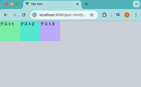
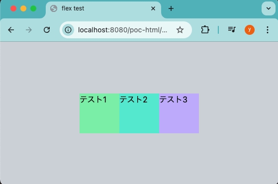
flexクラスで要素を横並びにする
flexクラスをつけることで、flexboxを適用して、子要素を横並びにできます。
<!doctype html>
<html lang="ja">
  <head>
    <meta charset="UTF-8" />
    <meta name="viewport" content="width=device-width" />
    <script src="https://cdn.tailwindcss.com"></script>
    <title>flex test</title>
  </head>
  <body class="bg-gray-300">
    <div class="flex">
      <div class="bg-green-300 h-20 w-20">
        テスト1
      </div>
      <div class="bg-teal-300 h-20 w-20">
        テスト2
      </div>
      <div class="bg-violet-300 h-20 w-20">
        テスト3
      </div>
    </div>
  </body>
</html>
headでTailwind CSSをCDNで読み込んでいます。
bodyでは、3つのdiv要素をひとつのdivタグで囲っています。
親のdivタグで、classにflexをつけています。
これで子要素が横並びになるため、結果下記のようになります。
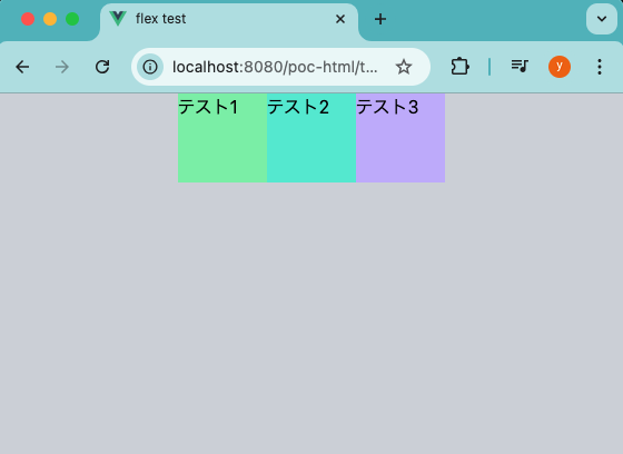
横並びにした要素を左右中央に並べる
justify-centerクラスをflexと使うことで、子要素を左右中央に置くことができます。 (以下からbodyタグ配下のみにしています)
<div class="flex justify-center">
  <div class="bg-green-300 h-20 w-20">
    テスト1
  </div>
  <div class="bg-teal-300 h-20 w-20">
    テスト2
  </div>
  <div class="bg-violet-300 h-20 w-20">
    テスト3
  </div>
</div>
適用されるCSSは下記になります。
.justify-center {
    justify-content: center;
}
.flex {
    display: flex;
}
結果、下記のように左右中央に並びます。
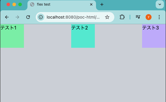
横並びにした要素を均等配置する
justify-betweenクラスをflexと使うことで、子要素を均等配置することができます。
<div class="flex justify-between">
  <div class="bg-green-300 h-20 w-20">
    テスト1
  </div>
  <div class="bg-teal-300 h-20 w-20">
    テスト2
  </div>
  <div class="bg-violet-300 h-20 w-20">
    テスト3
  </div>
</div>
結果、下記のように横一列で均等配置されます。
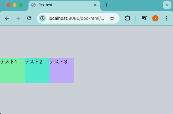
横並びにした要素を上下中央に並べる
items-centerクラスをflexと使うことで、子要素を上下中央に配置することができます。
親要素の高さが決まっている必要があります。(パーセント指定は不可でした)
<div class="flex items-center h-screen">
  <div class="bg-green-300 h-20 w-20">
    テスト1
  </div>
  <div class="bg-teal-300 h-20 w-20">
    テスト2
  </div>
  <div class="bg-violet-300 h-20 w-20">
    テスト3
  </div>
</div>
結果、下記のように上下中央に配置されます。
横並びにした要素を上下左右中央に並べる
上記で書いているjustify-centerクラスとitems-centerクラスを組み合わせることで、上下左右中央となります。
<div class="flex justify-center items-center h-screen">
  <div class="bg-green-300 h-20 w-20">
    テスト1
  </div>
  <div class="bg-teal-300 h-20 w-20">
    テスト2
  </div>
  <div class="bg-violet-300 h-20 w-20">
    テスト3
  </div>
</div>
結果、下記のように上下左右中央に配置されます。
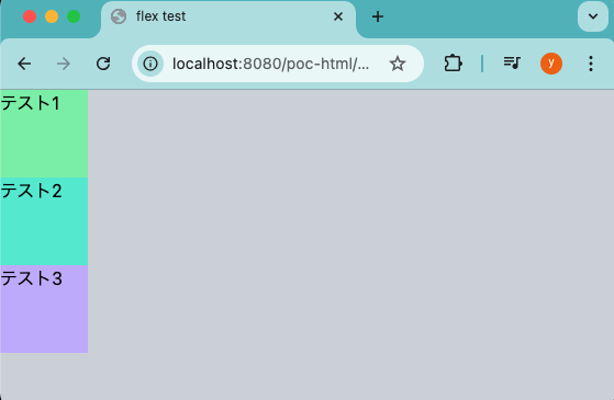
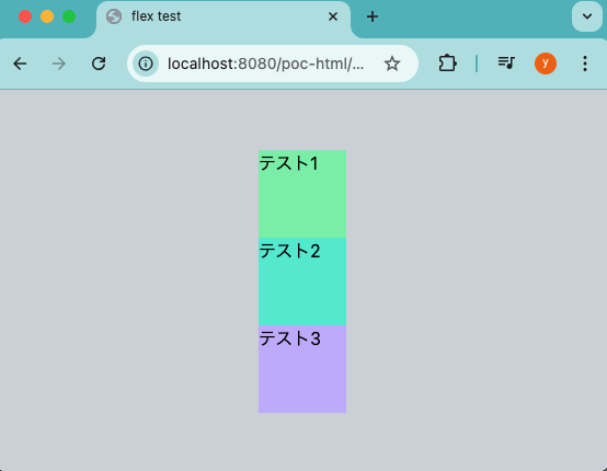
flexクラスで要素を縦並びにする
flexクラスと一緒にflex-colクラスを使うことで、flexboxが適用された状態で要素が縦並びとなります。
<div class="flex flex-col">
  <div class="bg-green-300 h-20 w-20">
    テスト1
  </div>
  <div class="bg-teal-300 h-20 w-20">
    テスト2
  </div>
  <div class="bg-violet-300 h-20 w-20">
    テスト3
  </div>
</div>
結果、下記のように縦に配置されます。
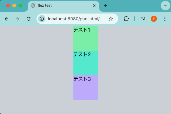
縦並びにした要素を左右真ん中に並べる
flex・flex-colクラスと一緒にitems-centerクラスを使うことで、縦並びの要素を左右中央に並べます。
<div class="flex flex-col items-center">
  <div class="bg-green-300 h-20 w-20">
    テスト1
  </div>
  <div class="bg-teal-300 h-20 w-20">
    テスト2
  </div>
  <div class="bg-violet-300 h-20 w-20">
    テスト3
  </div>
</div>
結果、下記のように縦に配置されます。
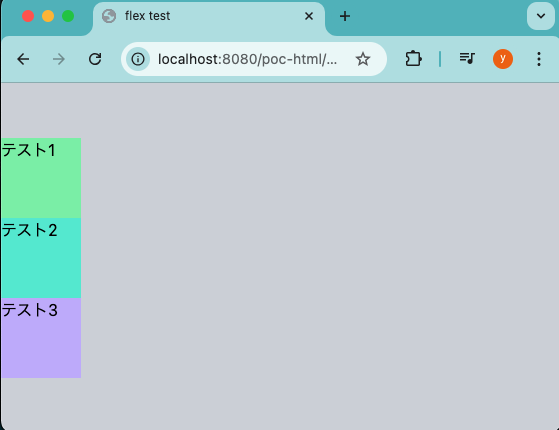
縦並びにした要素を上下中央に並べる
flex・flex-colクラスと一緒にjustify-centerクラスを使うことで、縦並びの要素を上下中央に並べます。
こちらも親要素の高さが決まっている必要があります。
<div class="flex flex-col justify-center h-screen">
  <div class="bg-green-300 h-20 w-20">
    テスト1
  </div>
  <div class="bg-teal-300 h-20 w-20">
    テスト2
  </div>
  <div class="bg-violet-300 h-20 w-20">
    テスト3
  </div>
</div>
結果、下記のように縦に配置されます。
縦並びにした要素を上下左右中央に並べる
flex・flex-colクラスと一緒にitems-center・justify-centerクラスを使うことで、縦並びの要素を上下左右中央に並べます。
<div class="flex flex-col items-center justify-center h-screen">
  <div class="bg-green-300 h-20 w-20">
    テスト1
  </div>
  <div class="bg-teal-300 h-20 w-20">
    テスト2
  </div>
  <div class="bg-violet-300 h-20 w-20">
    テスト3
  </div>
</div>
結果、下記のように縦に配置されます。
終わりに
今回はTailwind CSSでFlexboxを使う方法について書きました。
Tailwind CSSに関連クラスがしっかりと定義されているので、class属性に書くだけで簡単に使うことができました。


コメント